Blog

fleeting look | julie wheat

Graceful. Fleeting. Julie was a figure model in St. Louis. She was a welcome subject of mine for several years, and always professional. These images are some of my earliest work in the studio, and represent a time of great experimentation and study. Lit with a single Profoto in a large softbox, Julie's skin appears porcelain. I shot her against black seamless paper, then added the subtle blue and texture in Photoshop. Sometimes one light is all it takes.

Ryan Walters  |  St. Louis Photographer

my wife | puerto rico


In 2009, Holly and I were fortunate enough to take our first trip to Puerto Rico together. It was a vacation I'll never forget. It was her very first visit to the ocean, and my first time in Puerto Rico, we both had an amazing week. We stayed in a hotel called the Conrad San Juan Condado Plaza and I highly recommend it.  The hotel's lobby was featured in Ocean's Eleven when several scenes with Brad Pitt and George Clooney were filmed there. We spent the majority of our time on the beach and shopping in Old San Juan, but the hotel was always an oasis to retreat to in the evenings. I fell more in love with the girl who would become my wife in rural surfer towns along the eastern coast of Puerto Rico.  It was then I knew I wanted to spend my life with her. We were married in 2010, and journeyed back for our honeymoon.

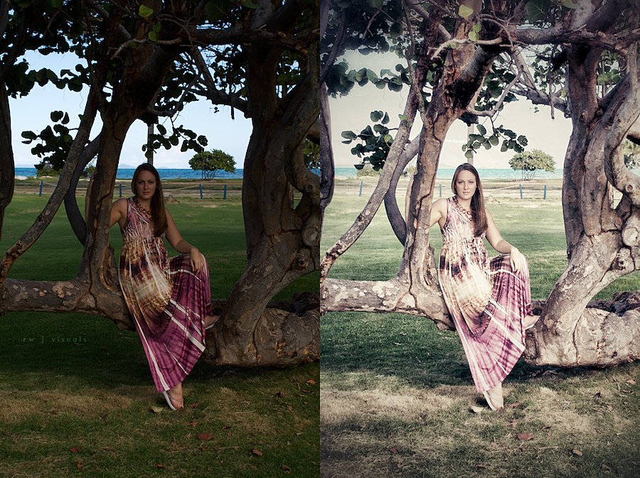
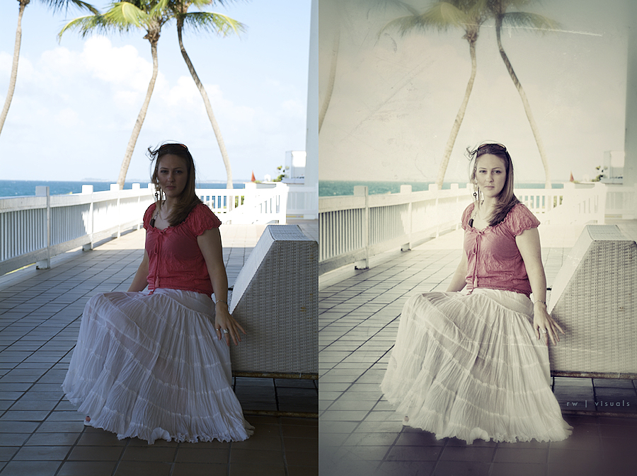
The image on the left is straight out of my camera, and the one on the right was edited using NIK's Snapseed. It's software that saves a professional photographer time when working to create vintage looks like this one. It's available for iPhone, iPad, and Mac. Give it a shot.

Ryan Walters  |  St. Louis Portrait + Commercial Photographer

macy + jeremy

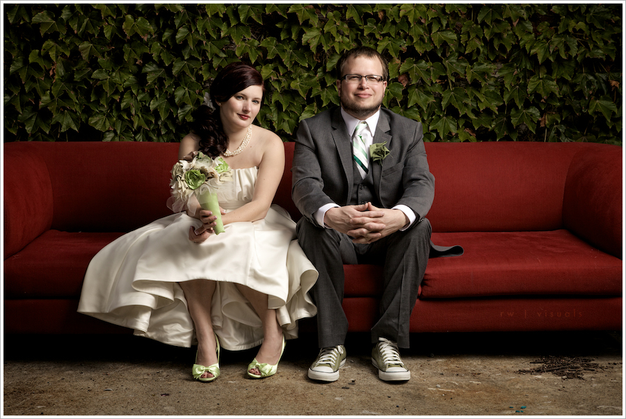
These two people are awesome. I've had the pleasure of calling them colleagues at Apple for several years now, and it's been cool getting to know them. Macy and Jeremy are both incredibly creative people, and it's been interesting to watch them evolve and become entrepreneurs recently. They own a wedding videography business named Rue de la Vie. Check them out for all your wedding and save the date video needs! Having shot my wedding, I can personally recommend their services. They are professional, and they do a phenomenal job capturing your big day! They even offer Blu-Ray output! Thanks to you both for letting me be a part of your day, and I wish you all the best in your journey together!

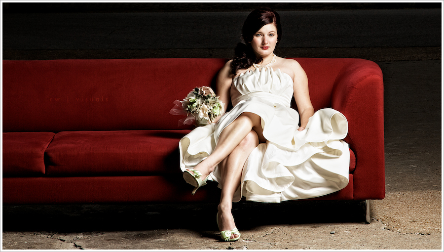
For these shots, we placed the red sofa in an alley behind their home in Soulard. The ivy happened to be covering a nearby building, and I liked the texture it provided. We lit both shots with one light and a large octabank. The light was powered by a Vagabond II.

Ryan Walters  |  St. Louis Portrait + Commercial Photographer

spaced out | dropkick the robot

Please be sure to select HD for the best viewing experience. Simply click the "HD" logo near the lower right of the video, then click Play.

This is the first of a series of live music videos shot in studio with Dropkick the Robot. These guys are phenomenal musicians! They are dedicated to their craft, and their music reflects it. We had the opportunity to collaborate with them to produce a series of seven songs, which were all performed and captured live.  This is the biggest video project we've shot to date! It involved several months of planning, production meetings, putting a solid team of operators together, innovating some lighting methods for a relatively small recording studio, and executing a nine camera shoot in full 1080p!! We shot everything at 24fps to lend a film look to it, and I lit the studio with a cinematic style in mind.


This is 1 of 6 songs captured on a Sunday evening in March. The remaining 5 will be published very soon, so check back if you're interested in seeing them!


The band, Dropkick The Robot, is based within the Midwest, containing a huge range of musical talent with a variety of sounds that are showcased within this meeting of creative minds.

The production utilized a mixture of Canon 5D Mark ll's, Canon T2i's, Arri D Flex kits, and several assorted Canon L Series lenses.

In Post-Production (handled entirely by the very talented, Tim Kotthoff), the H.264 files were immediately backed up to multiple drives and then transcoded to ProRes 422 and ProRes Proxy files. These transcodes were also backed up. The ProRes Proxy files were then all synced in Final Cut Pro 7 and cut/assembled using Multi-Cam within Final Cut. After all of the cuts were approved each of the songs were taken offline from ProRes Proxy and reconnected online to the ProRes 422 transcodes. They were then all color corrected and graded within Color.

We hope that you enjoy it!


This project couldn't have gone as smoothly without the following people's dedication and willingness to help:

Tim Kotthoff | Producer, Co-Director, Editor, Colorist

Ryan Walters | Producer, Co-Director, Director of Cinematography

Eric Becker | Camera Operator

Cari Smick | Camera Operator

Gary Winchester | Camera Operator

Michael J. Kraemer | Camera Operator

Eric Witthaus | Camera Operator

Dan Mehrman | Sound Engineer

Big thanks to the band as well!

Ryan Walters  |  St. Louis Photographer + Cinematographer
 

mary beth sales

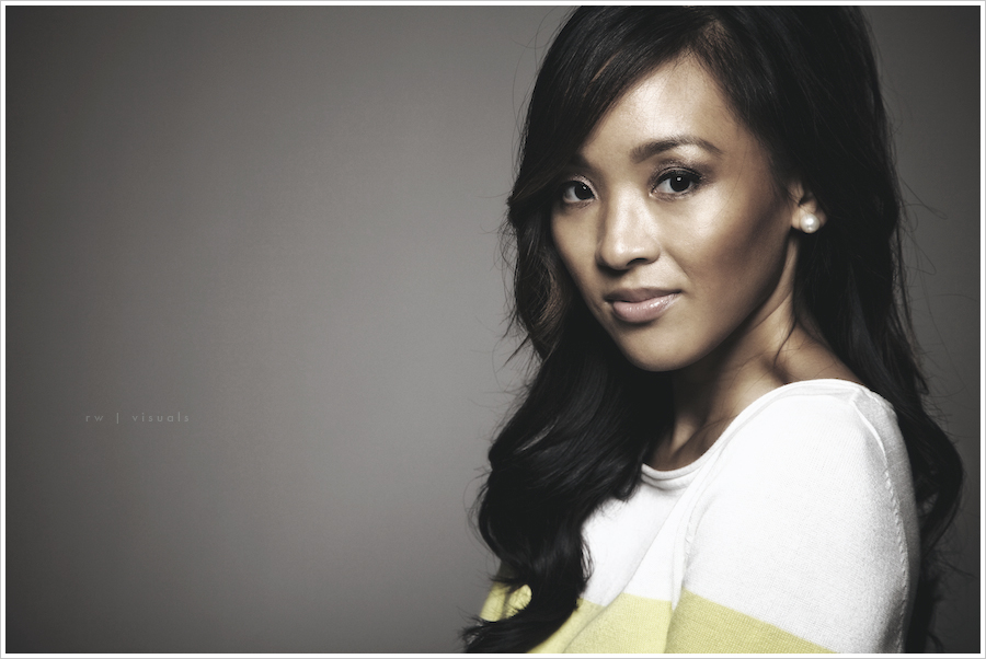
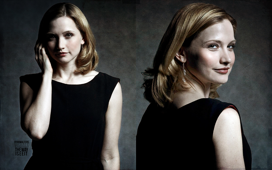
This is Mary Beth Sales. She's a former rockstar PR girl from LA, and used to be a commercial model here in St. Louis. These days she's poised to launch her real estate career in LA. Mary Beth's experience was evident during our shoot. She made my job easy! For all you hipsters on the west coast in need of new digs, hit her up!

With this image, I worked to diminish the contrast (very unusual for me), in an effort to produce a chalky, sort of smokey vintage look, almost as if there's a coat of wax smeared across it. I love the subtlety that's maintained in the detail of her hair, and the smoothness of the transitions from shadow to highlight. I may continue with this effort as images lend themselves to the aesthetic.

Ryan Walters  |  St. Louis Portrait + Commercial Photographer

16x9

Recently I've been investing what little free time I can scrape together into studying 5D cinematography, and it led me to appreciate the 16x9 aspect ratio of a frame. Although I don't assume it will become a habit with my still work, these images are cropped with a cinema ratio in mind. They were shot as stills and intended to better illustrate the look of a short film I'm considering producing. The post work seen here would be the goal of the color grade for the final look, although I'm not sure I'm capable of replicating it with film. My ability to create a look for still photography far surpasses my ability to grade film at the moment, although my goal is to equal those aptitudes in the near future. The first image was lit with an ordinary household lamp, and the keyboard shots were lit with a small flashlight. I am absolutely in love with the shallow depth of field the 5D is capable of producing, provided the right lens is utilized. Here, all three images were shot with a Canon 50mm ƒ1.4, wide open.

As a side note, you may have noticed this is a slideshow featuring multiple images. It's the first of it's kind on my blog. As a viewer, I'm usually not a fan of slideshows as a means of presenting images in a portfolio. This is generally because I prefer to choose how long I view a particular image. Pausing seems like a viable option, though most slideshows I've seen on the web have incredibly abnoxious controls that distract from the image being displayed. In the past, if I wanted to publish multiple images from a shoot, I accomplished it by publishing one with my writing as an excerpt, which meant only one image would be displayed. To view the accompanying images, clicking on the title of the post was necessary. I've often wondered if anyone realized more images were available when publishing them in that manner, and I've experimented with different ways of improving the issue. My preference is to maintain a very clean, minimal aesthetic on my blog, and nothing really lent itself well to doing that...until this slideshow feature came about! This particular slideshow doesn't stray too far from the minimalist design of the blog, so I'll try it in several upcoming posts to get a feel for it. To freeze on a specific frame, simply click the image when it appears. Once frozen, hover your mouse over the left or right center and controls will appear, allowing you to advance or go back. Please comment if you find the slideshow distracting, or if you prefer it over the original method. Your feedback is welcome.

Ryan Walters  |  St. Louis Photographer + Cinematographer

desert wedding

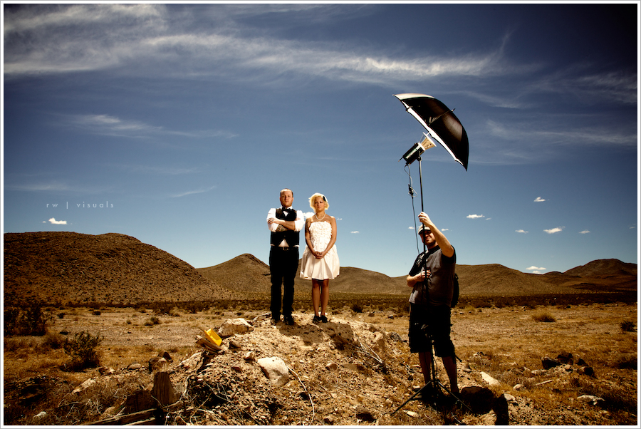
I recently had the honor of shooting some wedding images for these two beautiful people. Stephen Fee and his bride, Candice, are absolute rock stars. They got hitched in Vegas in May, and I thought they would be the perfect couple to shoot some killer alternative wedding stuff with. Ceasars Palace has a strict "No Photography" policy during the ceremonies that take place there, so we rolled out in the desert the next morning. My gaol was to find a desolate location that looked like it was in the middle of nowhere, and this scene was just about exactly what I had in mind. Big thanks to Tim Kotthoff for assisting me! He and I road tripped so we could travel with some serious studio gear, and the resulting images are well worth the extra travel time! Check back for a series from this shoot! They'll be posted in the "featured" section of the blog. For now though, here's a look behind the scenes.

Ryan Walters  |  St. Louis Portrait + Commercial Photographer

light meter?

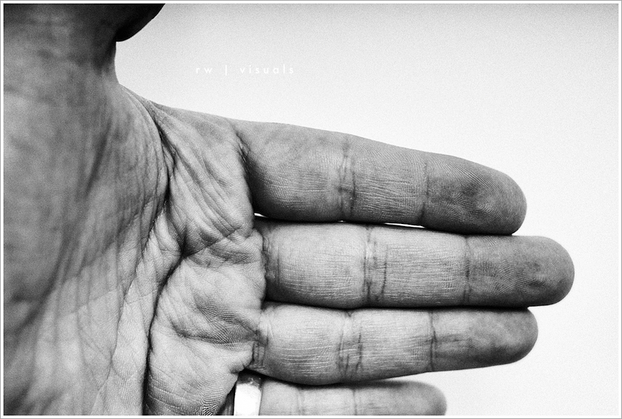
Who needs a light meter?  You have two already.  Many times, I've used my hand to check my exposure after setting up lights.  It's especially useful if you're working alone and prefer to look professional and have the set lit before your client arrives.  It's a starting place; a place to begin and work from, until you find your perfect exposure.

Ryan Walters  |  St. Louis Portrait + Commercial Photographer

target

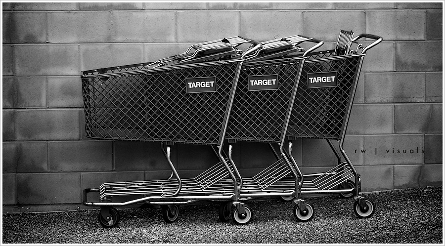
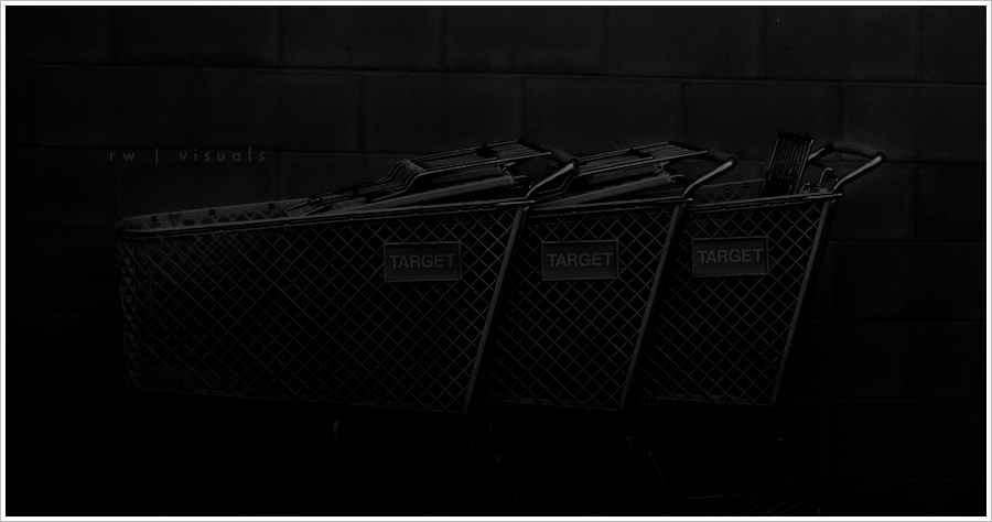
Interesting how the same scene can communicate so differently when the approach is changed.  These images were shot with the same camera seconds apart in broad daylight.  Except for some very minimal post work, the effect was created in camera.

Ryan Walters  |  St. Louis Portrait + Commercial Photographer

isaac

I recently had the pleasure of spending a Saturday at the zoo with this little guy, and face painting was among the highlights of the day! This image was shot outdoors with available light, but I rather like how it nearly looks studio lit. I placed Isaac in the shadow and let the sunlight blow out the sandy pave stones in the background. A little post work and instant white seamless!

Ryan Walters  |  St. Louis Portrait + Commercial Photographer